

*In this article, which is based on real data and experiences, the team name has been changed intentionally.
Team Kumbara
We started to work with Hüsnüye from Team Kumbara on August-September 2017, after she received her first Kanban (Team Kanban Practitioner) training on April 27, 2017.
She is a self-sacrificing and strong person. We started to work together as she wanted to establish her own system, but our adventure was cut short due to other priorities in the organization. I wanted to thank her for her efforts.
What I will write here is to provide an entirely outside perspective and get comments from other viewpoints. Although I try to comment, it will be incomplete. What is important is to help the team build an environment where they can discuss better; to create a feedback mechanism. The primary goal is to see the team support its own decision-making mechanism and make the right decisions with these graphs.
Summary
This report has been written to examine the following situations.
- How did the delivery rates triple between August and October?
- Why did the ready to deliver rates dropped after increasing fourfold between July and September?
- What is the cause of the fluctuation in August and its continuation from the customer’s perspective?
- What is the reason for the increase in in-team lead time values seen in the quarter.
- Are the works in the system still being pushed?
When we compare the values obtained from the customer’s and the team’s perspective, we can foresee that the system will not improve only with improvements on the team. Improvement will be achieved with a more coordinated operation of teams or turnaround points within the system.
I believe there are two types of team models with my current experience;
- To be a team to strictly and immediately fulfill the tasks and responsibilities assigned.
- To be a team to fulfill the tasks and responsibilities by questioning what should be in the entire system, by measuring its effect and proposing innovations.
Unfortunately, the most popular team model is the first one. If we want to move forward with an innovative perspective (Kaizen), I think we need to have a team model as stated in the second type.
Metrics should be used as auxiliary tools that enrich the conversations without replacing the conversation. Metrics should be used as a common language between two foreigners.
You can send me anonymous comments from: sayat.me/intparse
If you share your e-mail address while commenting, I can reply on that page without seeing your e-mail address.
Details are below. Thank you in advance for reading.
—
Alper Tonga
Demand Competence Review (from the Customer’s Perspective)
The chart below shows us the values for the works started and delivered between January and November 2017. Looking from the customer’s perspective means looking at all teams (Team Kumbara + analysis + testing). The reds represent works started and the greens represent the works delivered. The bar chart shows how many works have been started in that month (Ready 2 Prepare) and how many works have been delivered (Delivered). Example: 4 works started in May and 1 was delivered. The line graph shows the rates. Example: 0.39 works per day started in August (approx. 4 works in 10 days) and 0.10 works delivered per day (approx. 1 work in 10 days).
I marked some of the important events/days on the chart.
The question we want this graph to help us answer is; Can the system meet incoming requests at the desired level?
- If the red line (number of works started) is moving a little above (a little is a relative unit) the green line (number of works delivered), the system works without starvation. It means new works are pending.
- If the red line (number of works started) is moving a little above (a little is a relative unit) the green line (number of works delivered), the system works without starvation. It means new works are pending.
- If the red line (number of works started) falls well below the green line (number of works delivered), we can say that the demand started to decrease, or the team can meet the demands that could not be met before by increasing the competence or the project nears the end.
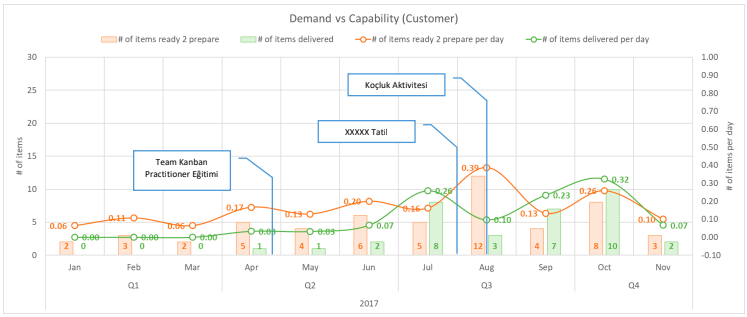
Observation
Considering that the data were collected in May, it is better to make our comments as of June. Accordingly;
- Considering that the data were collected in May, it is better to make our comments as of June. Accordingly;
- We see that the number of items delivered has tripled from August to October. It increased from 0.10 items to 0.32 items per day. Roughly, it rose from 1 item delivered in 10 days to 3 items delivered in 10 days.
- • At two points, in August and November, we see that the number of works delivered decreased after acceleration. Considering that the first two weeks of August were holiday, we can say the decline in August is normal. The decline in November may suggest that the Team Kumbara came to Freeze. We cannot know without asking the team.
It is more important to see how the team takes measures according to the circumstances. These charts review items in numbers. The ratio of the value obtained in the system to these numbers is more important than the size of the item. Even going through only numbers without this value and load balance/match will be a starting point for creating Kaizen.
These were the issues that concern the entire system. Let’s take a look at the factors in the team while these factors took place.
Demand Competence Review (from the Team’s Perspective)
The chart below shows the values about the items that were started to be developed and the items that were ready for test or delivery between April and November. The reds show items that were started to be developed and the greens show the items that were ready for test or delivery. The bar graph shows how many demands were started to be developed in that month (Ready 2 Start) and how many were ready to be tested or delivery (Ready 2 Accept). Example: In August, 9 demands were started to be developed and 7 items were ready for the test or delivery. The line graph shows the rates. Example: In August, 0.29 items were started to be developed per day (approx. 3 items in 10 days) and 0.23 items were ready to be tested per day (approx. 2 items in 10 days).
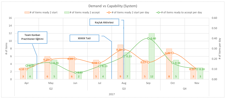
Observation
- We can say that the team can normally meet development demands, except for June and October.
- There may be 3 turning points from the team’s perspective. It may be good to listen to the team’s comments for June, September, and October.
- Beginning in June, the number of items ready to accept started to increase. The number of items ready to accept was 0.07 per day (7 items per 100 days) in June, while it was 0.40 per day (40 items per 100 days) in September. The effect of this increase on the number of items delivered (from the customer’s perspective) is seen after August. Congratulations on the WIP fixtures (see below).
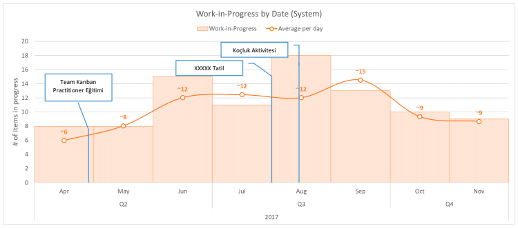
- After September, there is a dramatic decline in the number of items sent to test. The team WIP chart shows that there was a decrease in items that started to be developed after September. Could it be due to vacations or decrease in team members? Or, you may ask if a quality enhancing/informative experiment was made, such as pair programming.
So, what happened when they do that? Let’s look at the quality work demands, generated and solved problem rates.
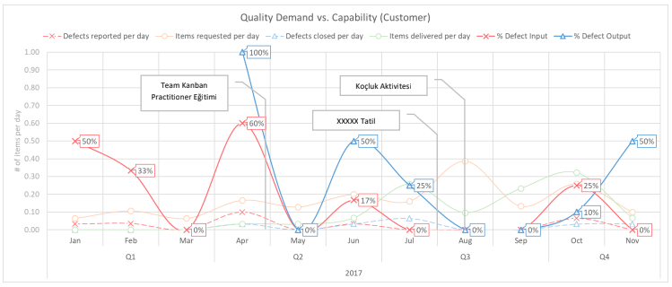
Quality Demand Competence Review (from the Customer’s Perspective)
The chart below shows us how many percent of the works started and delivered between January and November has defect record (bug). The reds show that the percentage of defect records (bug) of the works started and the greens show the percentage of defect records (bug) of the works delivered.
IMPORTANT: Any increase or decrease in these percentages does not imply an increase in bug records. If 3 of the 6 works started in a month has bug records, this makes up 50% bug rate and 2 of the 3 works started in the following month has a bug record of 66%. In such a case, it would be wrong to conclude that bug records increased.
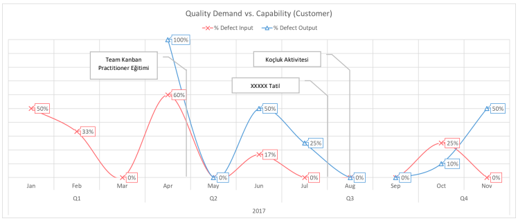
Observation
- Most of the works started in April include the highest bug records. In addition, all the works delivered in April have bug records because the blue line is at 100%.
- The percentage of bug records decreased in the items delivered in June – August. We can say that effort on bug records declined and more emphasis was put on new functions. In August and September, this rate hit zero and started to increase again as of October.
- Bug records reported from July to September – indicated by a red line – are reduced to zero. Bugs were reported again in October. It may be useful to get in touch with the team.
We can improve our review by showing the daily rates of the works started and delivered in the same chart in order to understand whether the bug records increased or not. The following graph illustrates that. Look at the dashed lines.
Balanced Work Distribution Review
The chart below shows us the process and occupancy of the system on a monthly basis between April and November. We can see from this chart whether the demand flow is accelerated/slowed/stopped (bottleneck) or if there is a balanced distribution.
We are trying to see situations of intersecting (starvation), thickening (overburden), or straight lines (no change).
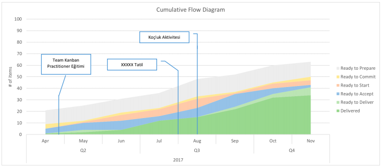
Observation
- It can be said that there has been a continuous increase in the number of works delivered between August and October (dark green zone). This increase came to a halt in November. Could there be freeze in November?
- The increase in the works ready to deliver (light green zone) as of August might have eased the deliveries. It is a good sign when this region becomes visible. We can say that the deliveries were made more planned (without starvation). This is a sign that the team began to focus on finishing rather than starting when managing the workflow.
- We see that the items ready to test (blue zone) started to increase and the items ready to start (orange zone) decreased (starvation) between August and September. We can say that the test team had a heavy workload and no new developments were received. This can be seen as a proof of focusing on finishing rather than starting. This is good.
- Although the rate of items delivered (dark green zone) is very low in November, we can see that the team has items ready to deliver (light green zone). Items may be deliberately not delivered, and it increases the likelihood of freeze.
- We see that the analysis works (yellow zone) have a fixed rate (~5 items) of workload through the whole graph.
Monthly Lead Times/Capacity/Output Review (from the Customer’s Perspective)
The chart below shows us the monthly lead times between April and November (average/75th percentile/85th percentile Lead Time) and the number of items that were started but not finished (in purple) as well as items delivered.
A decline in lead time values shown in green, blue, and orange lines indicate faster output. The fact that lead time values are close to each other shows that stability and predictability are high. The dashed purple line indicates the number of items delivered in that month, and the purple line shows the number of works that were started but not finished (WIP: work-in-progress).
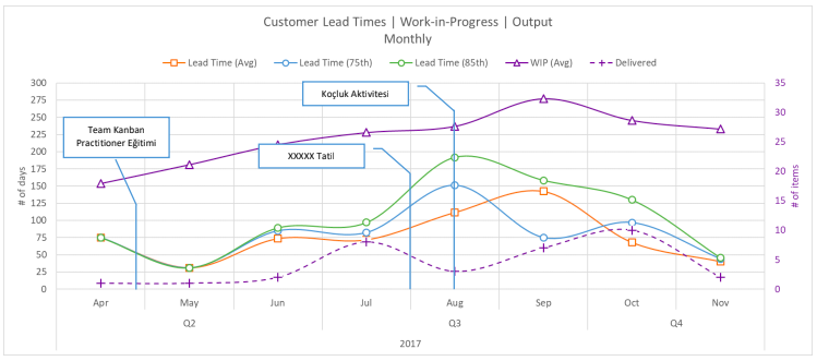
Observation
- The lead times begin to increase in August when the works were delivered within 25 days in May. Lead time values start to range between 200 and 100 days. We can say that it started to recover after September.
Note: Such a disintegration may be the result of the completion of old jobs. When the works that were not given enough priority/delayed due to the time distress caused by the workload on the team are finalized, the lead times are prolonged and cause such a disintegration/fluctuation in the graphics. If we have any backlog, these disintegrations will repeat at regular intervals.
The team may have had time to focus on their accumulated works (cleaning) by creating slack time as a result of observed improvements, new policies or better understanding of the system. It seems that this cleaning continued during August, September and October. - After September, there were improvements in lead time. As the lead time values declined, the number of works delivered (dashed purple lines) started to increase. We can say that the team started to focus on finishing rather than starting. Nice improvement. (Stop starting, start finishing.)
- As of November, the lead time is around 50 days. The fact that lead time values get closer to each other can be pointing towards a more stable and balanced system.
- The fact that the lead time value of November is around 50 days can be interpreted as a sign that past works are still underway since we are looking at a 30-day interval. WIP values (purple line) will help us understand why. The number of pending or waiting works in the system of Team Kumbara reaches 30. These values are reduced to 25 by November.
- • We cannot entirely see the effect of reduced WIP values. The question of whether there was freeze in November gains importance here. Suggestion: The lead time targets should be below 30 days as this system has monthly deliveries. They can achieve that by reducing WIP values more.
Let’s see what is going on inside the team in the meantime.
Monthly Lead Times/Capacity/Output Review (from the Team’s Perspective)
The chart below shows us the monthly lead times between April and November (average/75th percentile/85th percentile Lead Time) and the number of works that were started but not finished (in purple) as well as works delivered.
In the previous chart, we reviewed our observations from the customer’s perspective, and we will review from the team’s perspective. Differences;
- The lead-time values show the time between the start of analysis and delivery from the customer’s perspective, while they show the time between the start of development and ready to deliver in this graph.
- The number of works in progress (WIP) is counted from the beginning of the analysis from the customer’s perspective, while the works that are started to develop and come to the test phase are counted as WIP in this graph.
- The number of outputs is the number of works delivered from the customer’s perspective, while the number of outputs (dashed purple line) shown in this graph is the number of works ready to deliver.
Observation
- We see an increase in the number of works ready to deliver (dashed purple lines) between June and September. This increase starts to fall rapidly after September.
- WIP values (straight purple line) did not exceed 15 items and dropped to 9 items at the end. This is a good situation. Rather than taking on more work and waiting for a long time to finish, it is better to reduce the number of works and get more quality results in a shorter time.
- The fluctuation of lead times in September is remarkable. There are items that took over 60 days from they were started to be developed until they were ready to deliver in the 85th percentile (green line). There may have been a cleaning. (We considered the time from analysis to delivery while looking from the customer’s perspective.)
- We can assume that there will be a fluctuation again based on the lead time values observed in November.
- • This fluctuation occurred in August from the customer’s perspective; there were 100-day differences between percentiles. But the August lead time values were very close to each other in this chart and lasted maximum 9 days. The works ready to deliver may not have been delivered, or the development of these works started after waiting for a very long time after the analysis was completed and finished in a short time by focusing on them which was reflected to the customer as such. Personal Opinion: Stockpiling is not a good thing, even if we have to do it sometimes. Any item that waits for a long time in the warehouse will cause fluctuations in our systems and prevent us from seeing forward. Therefore, the WIP limit should be applied not only to the team but also to the pre-team points. This will lead us to more effective work. Now I’m reviewing this graphic based on the data I have, but the actual value will come out after the comments made by the team. The opinions and comments of the team/teams in the system are more important than anything else.
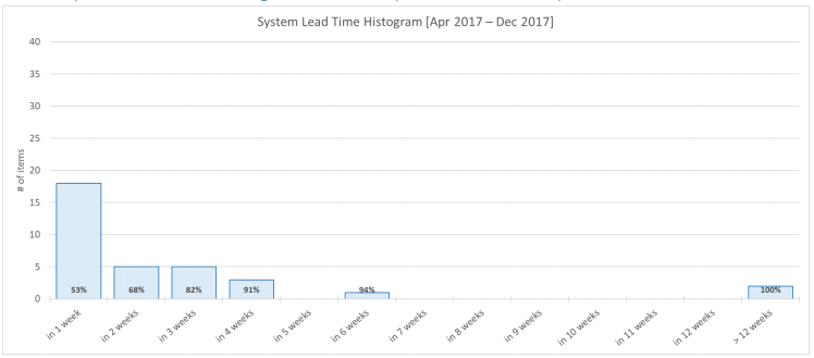
Last 9 Months Lead Time Histogram Review (from the Customer’s Perspective)
The chart above shows the lead time distribution of the works delivered within the last 9 months in weekly percentiles. Example 1: 74% of the items delivered between April and December were delivered within 11 weeks. The keyword here is “within”. We can say that 74% of the items delivered did not take 11 weeks to be delivered but they took maximum of 11 weeks. Example 2: If we put all the items delivered in a bag and choose one randomly, we are 74% likely to choose an item that took maximum 11 weeks or less to be delivered.
Using this distribution, we can make a quick estimation about how long the new works will take. Sharing the distribution with stakeholders within the system shows the possible project deadlines by giving information about how long the works will take (in the first stage before the detailed analysis is made) and about the risks. I can say that this supportive method is better than promising a deadline without knowing anything. (This approach has been used in history. See German Tank Problem, Troy Magennis; Percent Likelihood)
I can tell my customer who is asking when a new request will be delivered by using this distribution: Note: This distribution chart shows the distribution from the customer’s perspective, which means that it does not include only the Team Kumbara’s values; the whole system (analysis, testing, delivery) is here.
- There is a 74% chance that it will be delivered within 11 weeks (~3 months).
- There is an 85% chance that it will be delivered within 16 weeks (~4 months).
- There is a 94% chance that it will be delivered within 24 weeks (~6 months).
This distribution is a histogram, i.e. a history. Looking at a long range of 9 months may not produce meaningful results due to the rapid change of work environment, teams or projects. Therefore, it is best to look at the last 3 months or a specific period based on the structure of the system. If the teams have changed or started a new project and the platform of this new project is completely different from the previous project (such as the transition from a Java project to a .NET project), it is useful to make an estimation in the light of new data without using the old data.
The classification of works based on the stages they go through or the way they are handled (classes of services) may further strengthen this estimation. Classifying by size, as seen in the literature, will not provide an advantage. Example: You have a small project and regular tasks in your work list. When the small project continues, a big project is sent to you, and you are instructed that it should be finished as soon as possible. Although the small project is already underway, it stops, and you focus on the big project. The big project is finalized in a month with extraordinary effort. Small project is completed with a delay of 1 month. Do you think that the size of the work plays a big role in the completion of the works faster? ????
Another point is that the longer the line extending towards right, the more unstable and unbalanced our system will be. If we want to shorten that line, we need to limit our works. (Limit WIP)
Let’s try to interpret what the team Kumbara did by looking at the 3-month (quarter) distributions. Thus, we can see if there is improvement by using distributions.
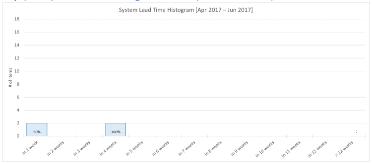
Q2 Lead Time Histogram Review (from the Customer’s Perspective)
The chart above shows the distribution of the lead time of the works delivered within the second quarter (April – June) in weekly percentiles.
Observation
- Customer or stakeholder did not have any works delivered within 4 weeks. The works could be delivered after waiting for at least 5 weeks. And the works delivered in these 5 weeks make up 25% of the works finished in the second quarter.
- 75% of the works completed in the 2nd quarter were delivered within 11 weeks.
- • Since deliveries are monthly, it can be a good method (fitness criteria) to expect more works delivered in 4 weeks to produce more value and to work effectively. We can see that there were no works delivered within 4 weeks from this distribution. However, there is a 50% chance that works can be delivered within 8 weeks (~2 months). Personal Opinion: 50% chance like flipping a coin. Instead of spending time planning, we can flip a coin as well. Starting the works that I cannot finish will slow me down and decrease the value I produce. Thinking about how to improve quality and how to prevent waste rather than aiming 100% system occupancy rate (trying to keep everybody busy) will increase system efficiency. Instead of focusing on 100% project work, 70% project and 30% improvement/personal training/experiment can be a more effective capacity distribution.
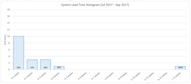
Q3 Lead Time Histogram Review (from the Customer’s Perspective)
The chart above shows the distribution of the lead time of the works delivered within the third quarter (July – September) in weekly percentiles.
Observation
- Our customer started to see works delivered within 4 weeks. And these works account for 11% of works finished in the third quarter. The chance of the works delivered in 5 weeks increased to 28%.
- In the 3rd quarter: 72% of the works were delivered within 11 weeks (75% was delivered within 11 weeks) 83% of the works were delivered within 14 weeks (80% percentile was not seen in the Q2 chart) 89% of the works were delivered within 24 weeks. (90% percentile was not seen in the Q2 chart.)
Lead times started to increase compared to the previous quarter. This may be due to the fluctuation in August caused by the completion of previous works, which we mentioned in the previous reviews.
- Our hypothesis is supported by the increase of our line to 26 weeks and its increase compared to the second quarter. 26 weeks means about 6 and half months. Considering that we are looking at a 3-month period, it is reasonable to say that previous works were cleaned. We can see the benefits of this cleaning in the long run.
- There are still monthly deliveries and there is an 11% chance of getting works ready to deliver in 4 weeks. In the Q2 chart, works could not be made ready to deliver in 4 weeks. In other words, we can say that the changes made in the system have an effect on monthly deliveries. Experiments may have begun to be noticed within the system. In addition, these experiments help determine the improvements that will have long-term returns in the system. Personal Opinion: These changes made by Team Kumbara within the system create a good experience and improvement environment with Kanban as they are evolutionary and minor changes. Performing a controlled experiment within the system rather than attempting experiments that will have a big effect in the organization creates win-win situation for both parties.
- We can also see that the number of works in the 3rd quarter is higher than the 2nd quarter.
Number of works delivered in Q2:4
Number of works delivered in Q3: 18
These data can be found in the Demand Competence Review in the first part of the report.
Q4 Lead Time Histogram Review (from the Customer’s Perspective)
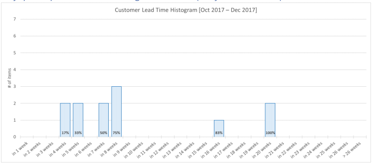
The chart above shows the distribution of the lead time of the works delivered within Q4 (October – December) in weekly percentiles.
Observation
- This Q4 chart only includes October and November. There is a possibility of a freeze in November. It is important for the system stakeholders to know how the work to be delivered at the end of December will affect this chart. The effect of this change on a system that has begun to gain stability and balance will be negative on the distribution and thus on the foresight.
- In the 4th quarter:
75% of the works were delivered within 8 weeks (72% was delivered within 11 weeks) 83% of the works were delivered within 16 weeks (83% was delivered within 14 weeks) 100% of the works were delivered within 20 weeks. (100% was within +26 weeks) - The highest lead time in the system is 20 weeks. The cleaning of previous works, WIP limitation, and other decisions taken by the team may suggest the beginning of improvement. There is an improvement in the 75th percentile, while the 85th percentile is slightly more open. Previous works may still be in the system. Of course, Team Kumbara can make better comments and show data.
- We can see that the number of works delivered in October and November is 67% of Q3. What will be the total number after those that will be delivered in December?
Number of works delivered in Q2: 4
Number of works delivered in Q3: 18
Number of works delivered in October and November only: 12
These data can be found in the Demand Competence reviews in the first part of the report. What was the change in the team when all these developments were in the system? Let’s look at these distributions from the team’s perspective.
Last 9 Months Lead Time Histogram Review (from the Team’s Perspective)
The chart above shows the lead time distribution of the works sent to test or made ready to deliver within the last 9 months in weekly percentiles. Example 1: 82% of the works sent to test or made ready to deliver between April and December were sent to test or made ready to deliver within 3 weeks. The key word here is “within”. We can say that 82% of the works sent to test or made ready to deliver did not took 3 weeks but they took maximum of 3 weeks. Example 2: If we put all the items sent to test or made ready to deliver in a bag and choose one randomly, we are 82% likely to choose an item that took maximum 3 weeks or less.
Using this distribution, we can make a quick estimation about how long the new works will take. Sharing the distribution with the team members within the system shows possible project deadlines by giving information about how long the works will take and about the risks. With this supportive method, the team can compare how big or small the responsibility is.
I can tell my demandant who is asking when a new request will be ready to test or deliver by using this distribution: (Note: This distribution chart shows the distribution from the team’s perspective, which means that it does not include the times of analysis team or test team.)
- There is a 68% chance that it will be ready to test or deliver within 2 weeks (In 8 weeks from customer’s perspective)
- There is an 82% chance that it will be ready to test or deliver within 3 weeks (In 14 weeks from customer’s perspective)
- There is a 94% chance that it will be ready to test or deliver within 6 weeks (In 24 weeks from customer’s perspective)
When we compare the values obtained from the perspective of the customer and the team, we can foresee that the system will not improve only with improvements on the team. Improvement will be achieved with a more coordinated operation of teams or turnaround points within the system.
The classification of works based on the stages they go through or the way they are handled (classes of services) may further strengthen this estimation. Classifying by size, as seen in the literature, will not provide an advantage. Example: You have a small project and regular tasks in your work list. When the small project continues, a big project is sent to you, and you are instructed that it should be finished as soon as possible. Although the small project is already underway, it stops, and you focus on the big project. The big project is finalized in a month with extraordinary effort. Small project is completed with a delay of 1 month. Do you think that the size of the work plays a big role in the completion of the works faster? ????
Another point is that the longer the line extending towards right, the more unstable and unbalanced our system will be. If we want to shorten that line, we need to limit our works. (Limit WIP)
Let’s try to interpret what the team Kumbara did by looking at the 3-month (quarter) distributions. Thus, we can see if there is improvement by using distributions.
Q2 Lead Time Histogram Review (from the Team’s Perspective)
The chart above shows the distribution of the time that an item takes until it is sent to test or made ready to deliver within Q2 (April – June) in weekly percentiles.
Observation
- In Q2,
50% of the works were made ready to test or deliver within 1 week,
100% of the works were made ready to test or deliver within max. 4 weeks.
Q3 Lead Time Histogram Review (from the Team’s Perspective)
The chart above shows the distribution of the time that an item takes until it is sent to test or made ready to deliver within Q3 (July – September) in weekly percentiles.
Observation
- In Q3:
56% of the works were made ready to test or deliver within 1 week (It was 50% in 1 week)
72% of the works were made ready to test or deliver within 2 weeks
89% of the works were made ready to test or deliver within 3 weeks
94% of the works were made ready to test or deliver within 4 weeks.
The maximum time a work took is +12 weeks.
Lead times started to increase compared to the previous quarter. This may be due to the fluctuation in September caused by the completion of previous works, which we mentioned in the previous reviews.
- Our hypothesis is supported by the increase of our line to 12 weeks and its increase compared to the second quarter. 12 weeks means about 3 months. Considering that we are looking at a 3-month period, it is reasonable to say that previous works were cleaned. We will see the benefits of this cleaning in the long run (in the next quarter).
- We can also see that the number of works ready to test or deliver is more in Q3 compared to Q2.
Number of works delivered in Q2: 4
Number of works delivered in Q3: 18
This data can be found in the Demand Competence reviews in the first part of the report.
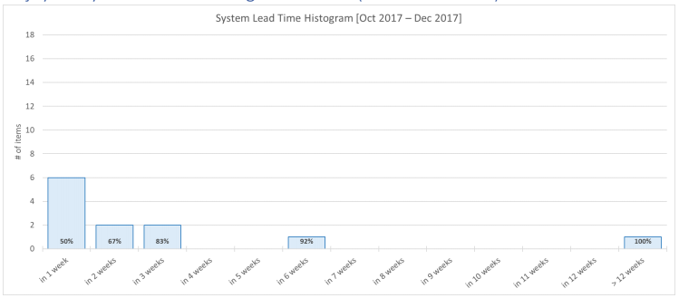
The chart above shows the distribution of the time that an item takes until it is sent to test or made ready to deliver within Q4 (October – December) in weekly percentiles.
Observation
- This distribution includes the values obtained in 3 months. It does not only include “October and November data” as it did from the customer’s point of view, because the team can always make an item ready to deliver.
- In Q4:
50% of the works were made ready to deliver within 1 week (It was 56% within 1 week)
67% were made ready to deliver within 2 weeks (It was 72% within 2 weeks)
83% were made ready to deliver within 3 weeks (It was 89% within 3 weeks)
92% were made ready to deliver within 6 weeks (It was 94% within 4 weeks) - The maximum time to make an item ready to test or deliver is +12 weeks. There is still no improvement compared to the previous quarter. Is it possible that the previous works were still tried to be finished? Could the workload (push) be too high? When we look at the team demand competence chart, we can see that the red line is above the green line (overburden) in October.
- We can also see that the number of works ready to test or deliver in this quarter is less than the third quarter. The WIP increase along with the new project pressure, freeze in November may be the cause of this decline.
- Number of works delivered in Q2: 4
Number of works delivered in Q3: 18
Number of works delivered in Q4: 12Bu verilere raporun ilk bölümündeki Talep Yetkinlik yorumlarından ulaşabilirsiniz.
Time to forecast!
I forgot to include this part in the report of Team Limitless. Let’s do that for Team Kumbara.????
There was a total of 20 works in progress when I imported this data. According to my algorithm, the completion of all these 20 works is as follows.
| Prediction according to… | Average | %75 | %85 |
| Q3 2017 data | Until April 27, 2018 | Until May 7, 2018 | Until July 16, 2018 |
| Q4 2017 data | Until April 27, 2018 | Until May 19, 2018 | Until September 4, 2018 |
For each new work; 75% ~+6 days, 85% ~+12 days can be added.
(This prediction is based on the current data. Should improvements occur, the model should be updated.)
Thanks again for reading and interpreting all the comments through 16 pages. Let’s never forget that we can still get the best and most realistic comments from the team itself.
Metrics should be used as auxiliary tools that will enrich the conversations without replacing the conversation. Metrics should be used as a common language between two foreigners.
For deeper comments, it is worth talking to the Team Kumbara.
You can send your anonymous comments at this address sayat.me/intparse
— Alper Tonga